The rebranding of the HC Koprivnice hockey club was not just another design project for me. It was deeply personal. I represented this club as a player throughout my life and I remain a dedicated fan who still regularly attends matches. For that reason, I approached the entire project with great respect for the club's history, the town and the people connected to it.
The goal was to create a modern and strong visual identity that would work across all media, from the logo, jerseys and merchandise to social media, print materials and stadium graphics. This was not intended as a cosmetic update, but as an effort to give the club a unified and confident visual style.
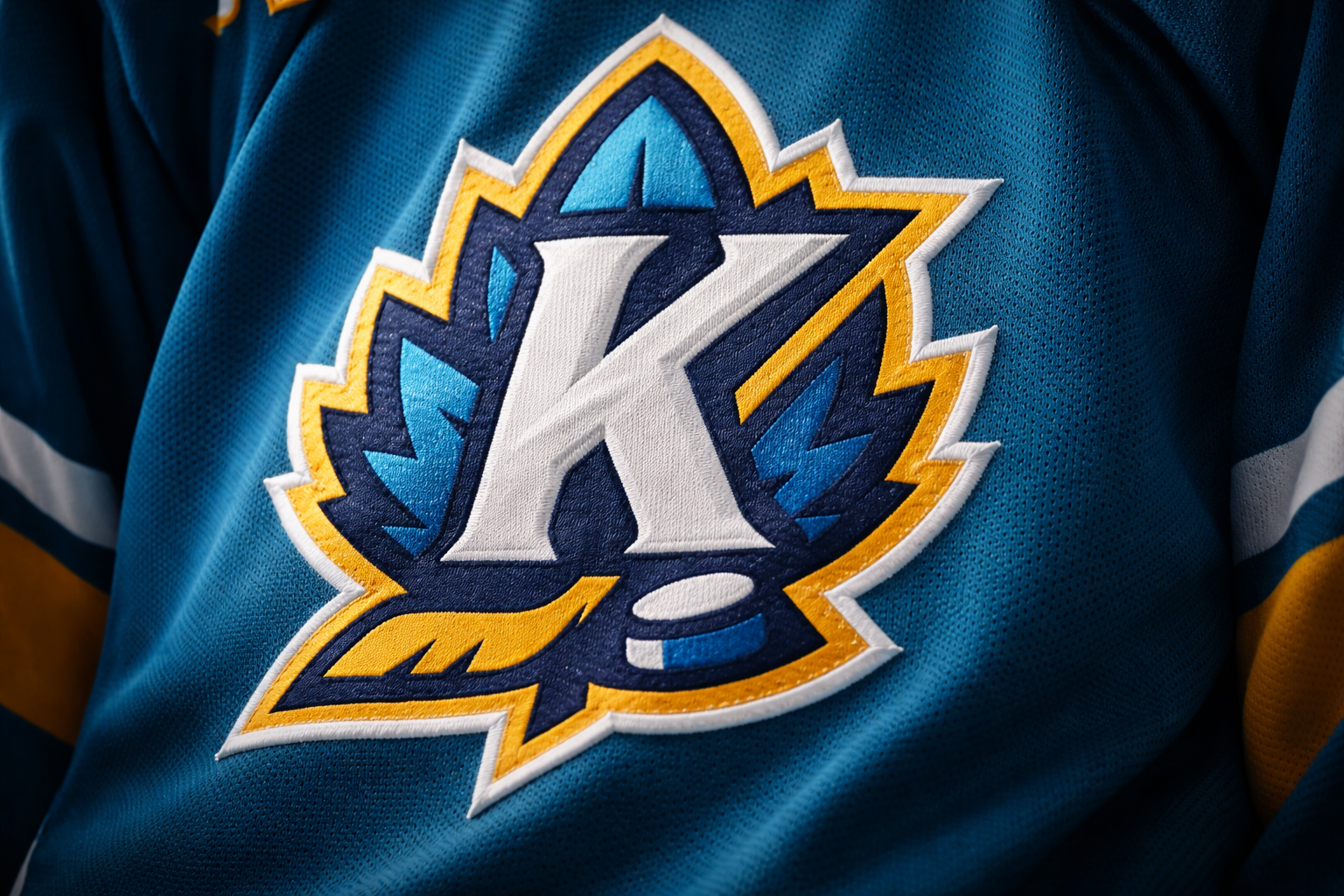
The logo itself contains several symbolic layers. Its foundation is a nettle leaf, referencing the name of the town, Koprivnice. Integrated into its shape is a dominant letter K and the symbol is completed by a hockey stick and puck, clearly connecting the mark to the sport. The logo therefore brings together the town, the club and hockey into one simple and distinctive symbol.
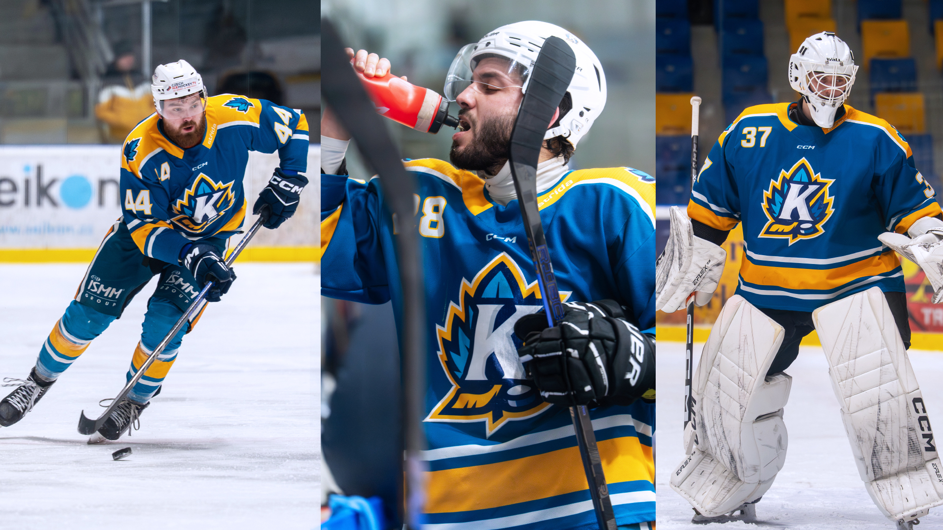
The colour palette is based on the traditional blue-and-yellow combination long associated with the club. The blue, however, was shifted slightly toward a blue-green tone, echoing the colour of a nettle leaf while giving the identity a more contemporary feel.
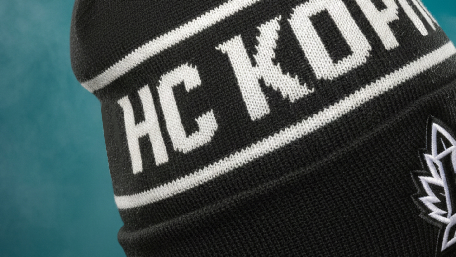
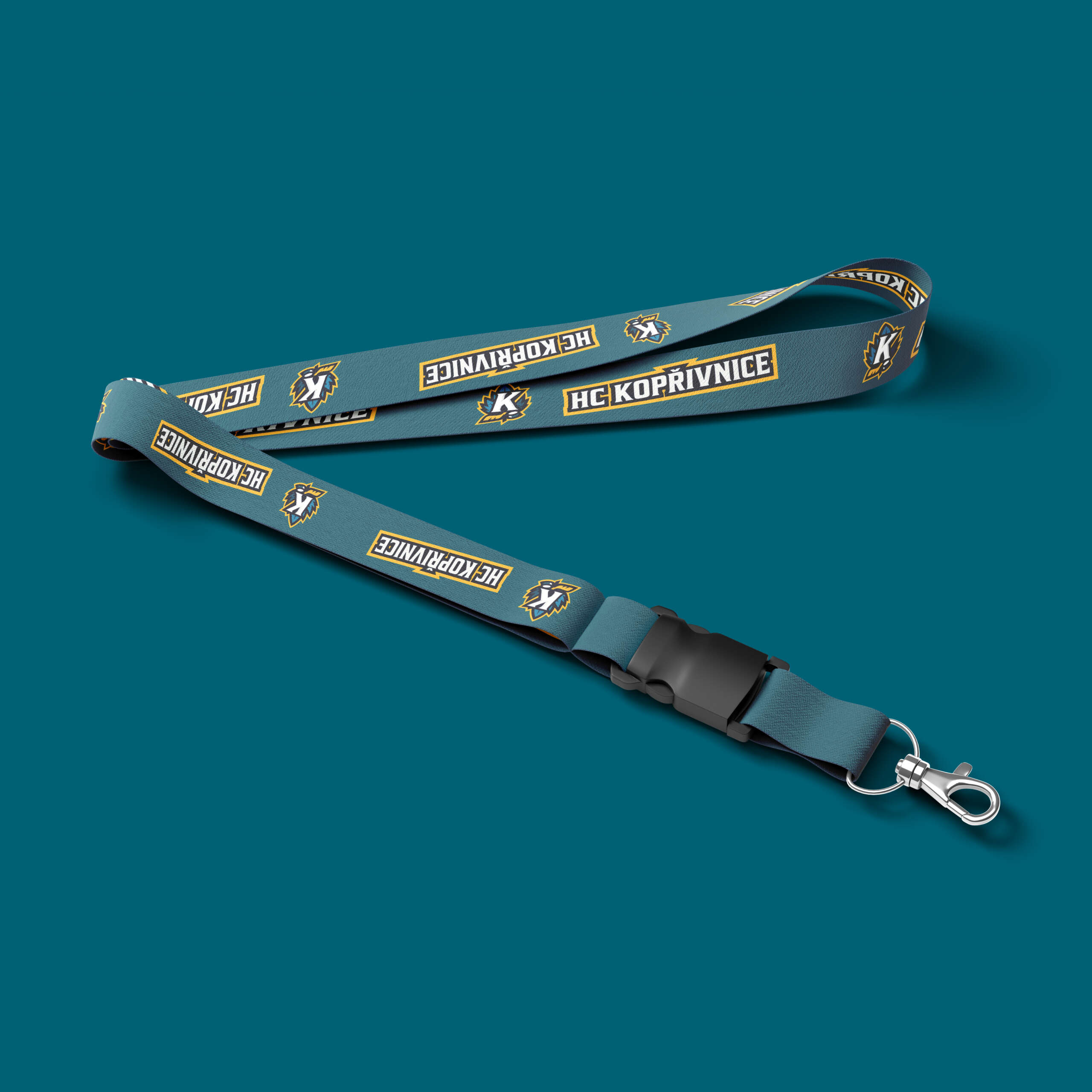
The project included far more than a new logo. It also covered new jerseys, fan merchandise, graphics for the ice surface, a visual style for social media and typography as well as additional logo versions for different applications. The goal was to create an identity that could represent the club long-term and that both players and fans would be proud to wear.