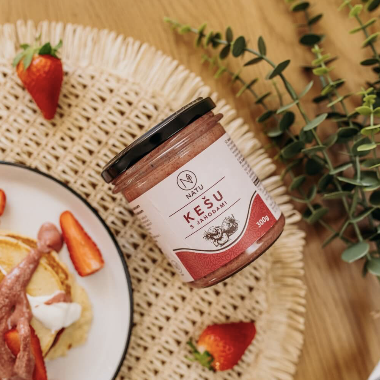
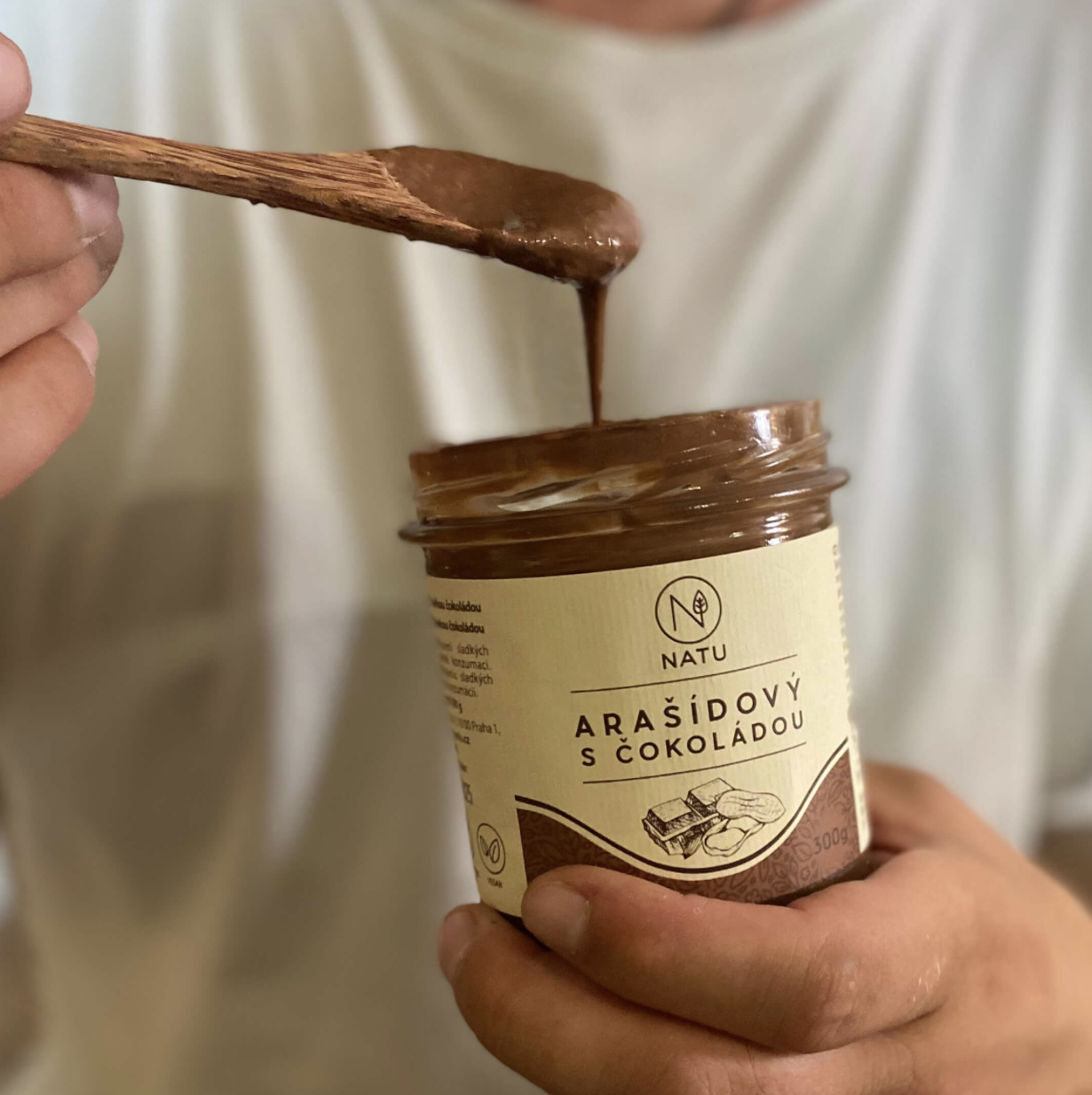
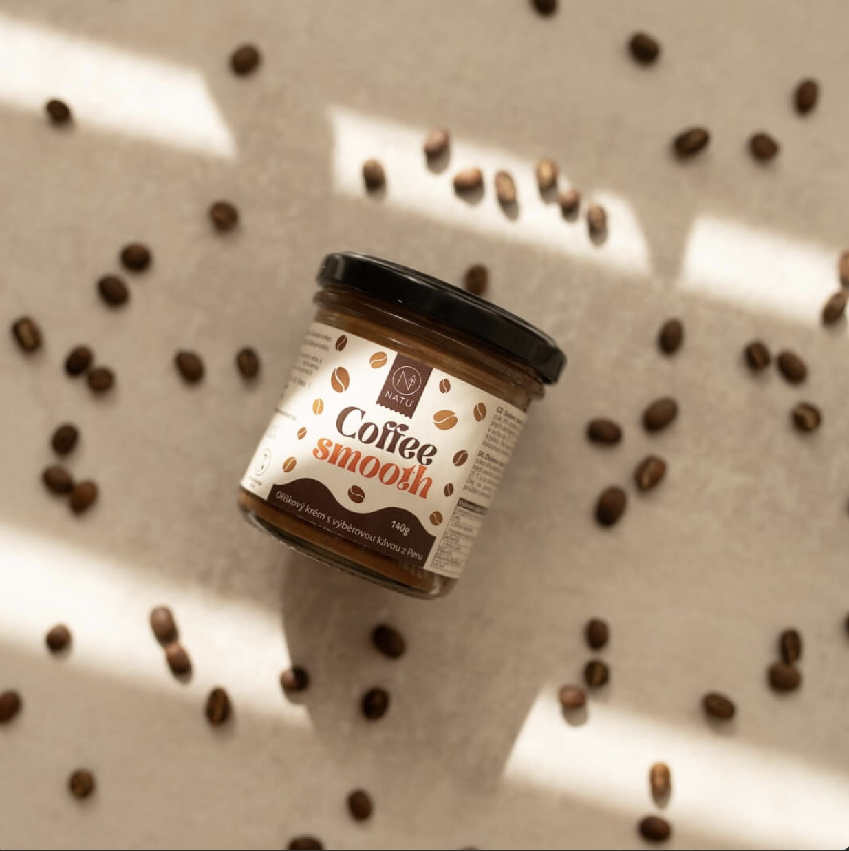
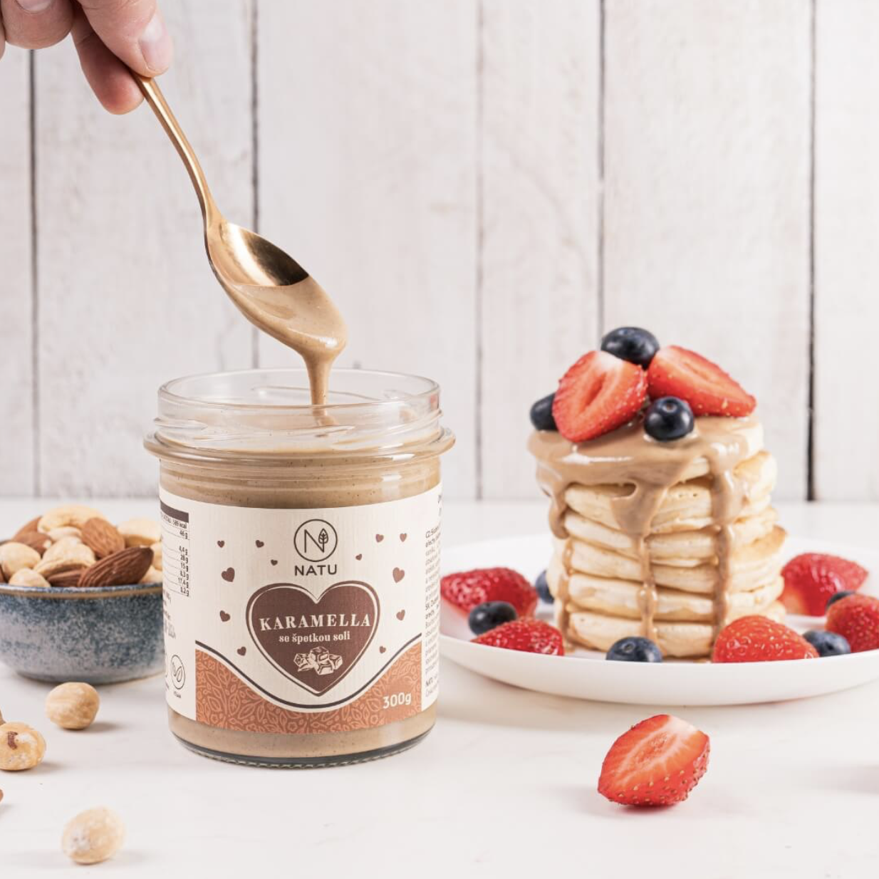
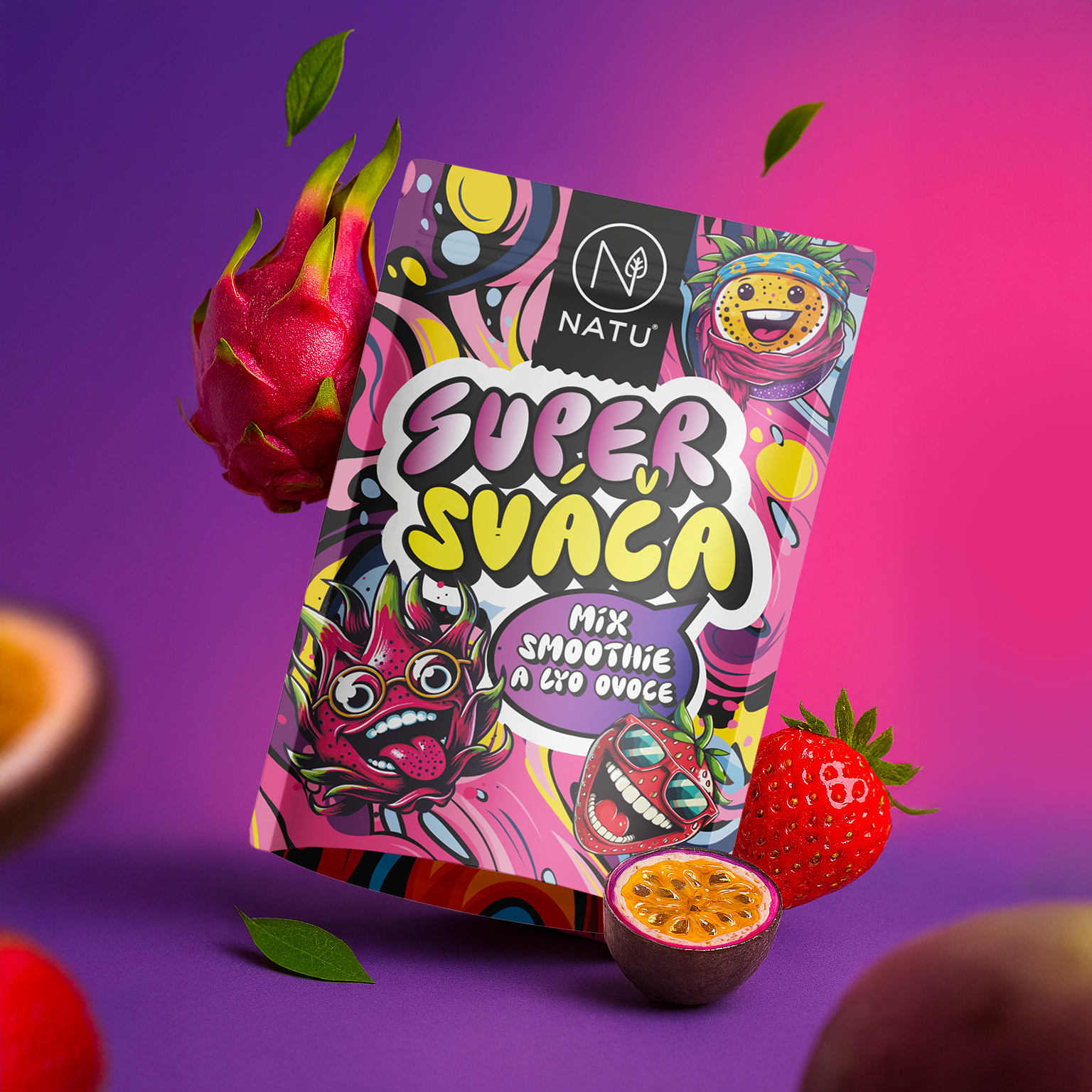
The packaging design for NATU's nut cream range focused on connecting honest ingredients, premium quality and a clean, timeless aesthetic. The aim was to create a visual identity that immediately communicates the natural character of the product, its craft quality and the expectations of a modern customer.
The design uses a calm composition, subtle colour palette and a strong focus on the legibility of key information. Each package was designed to clearly distinguish individual variants while remaining part of a unified product family. Typography and graphic elements support a sense of trust, quality and authenticity, values on which the NATU brand has long been built.