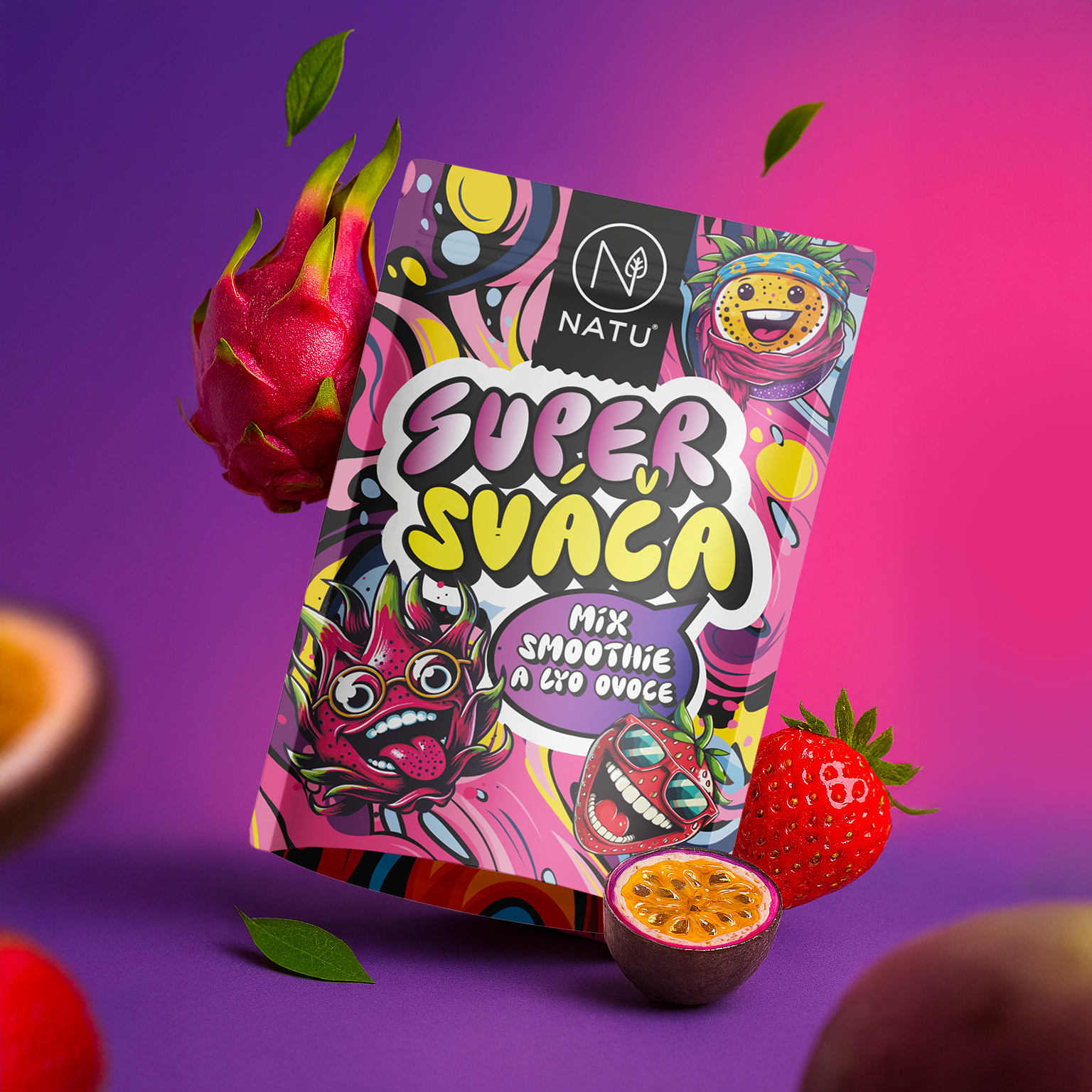
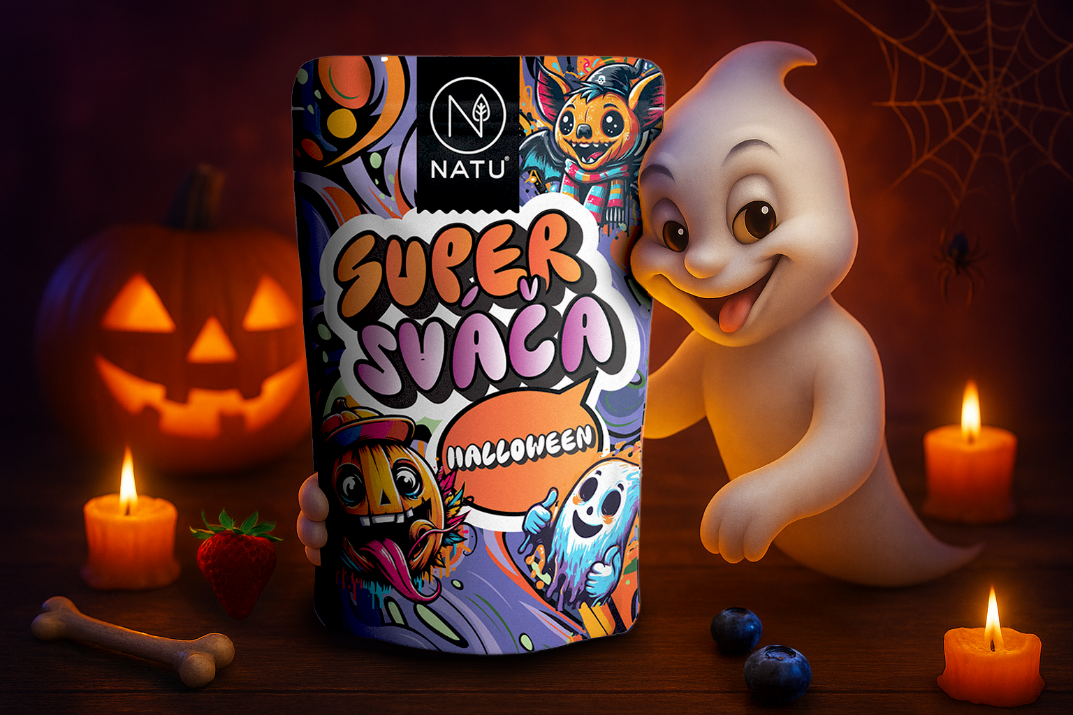
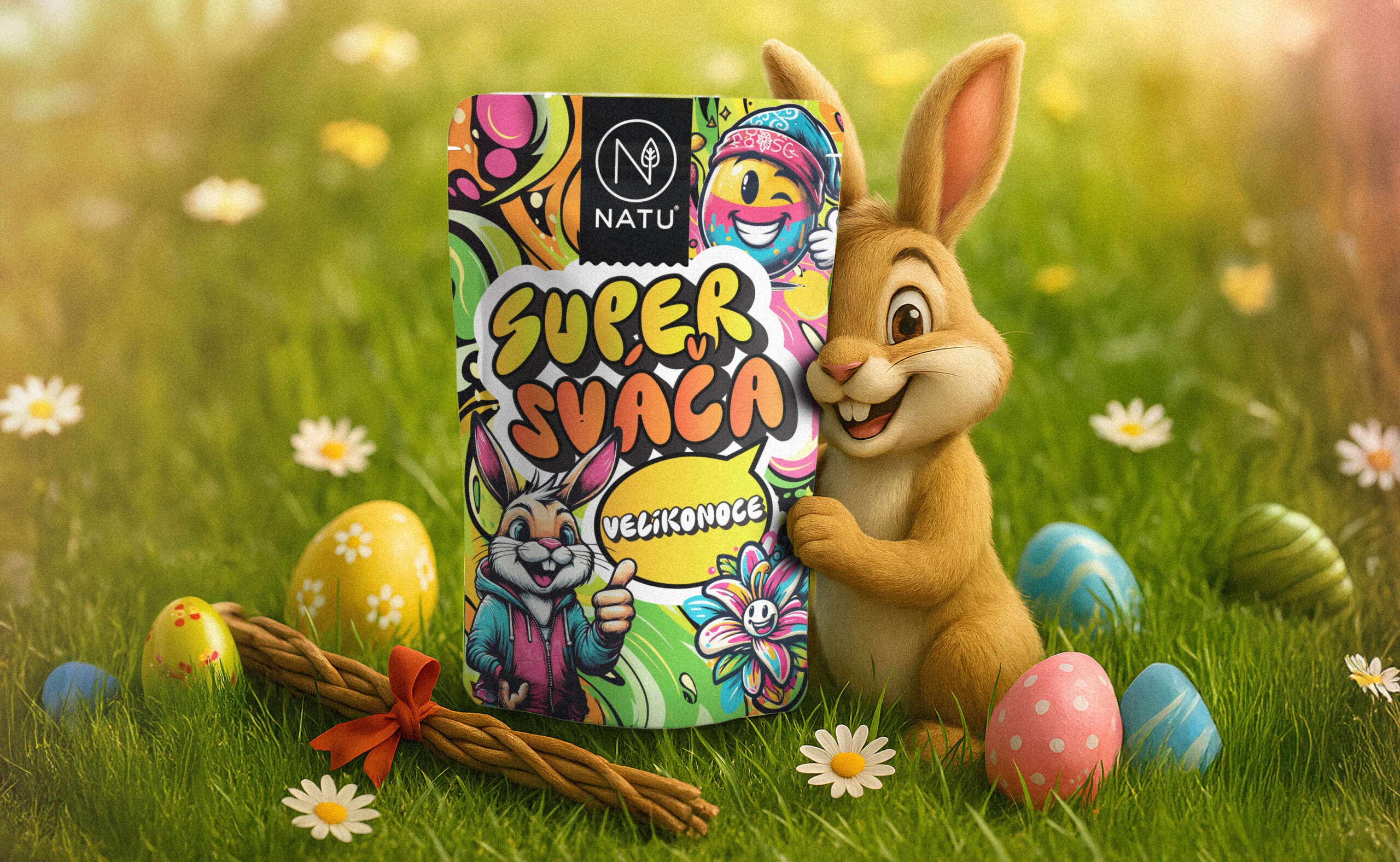
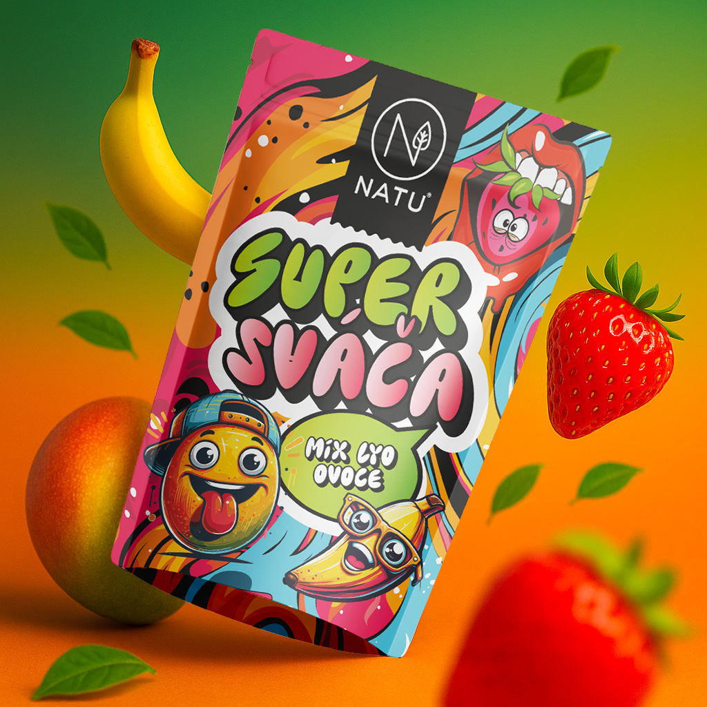
The packaging design for NATU's SUPERSVACA product range was built around a unified and easily recognisable visual system aimed primarily at school-age children. The objective was to combine playfulness, bold colour and an illustrative style with a clear information hierarchy. The design balances emotion with functionality. It helps customers navigate the product range, while increasing shelf visibility and brand recognition. A strong emphasis was placed on consistency across individual flavours, legibility of key information and the creation of a distinctive visual identity that works both in retail and in online environments.