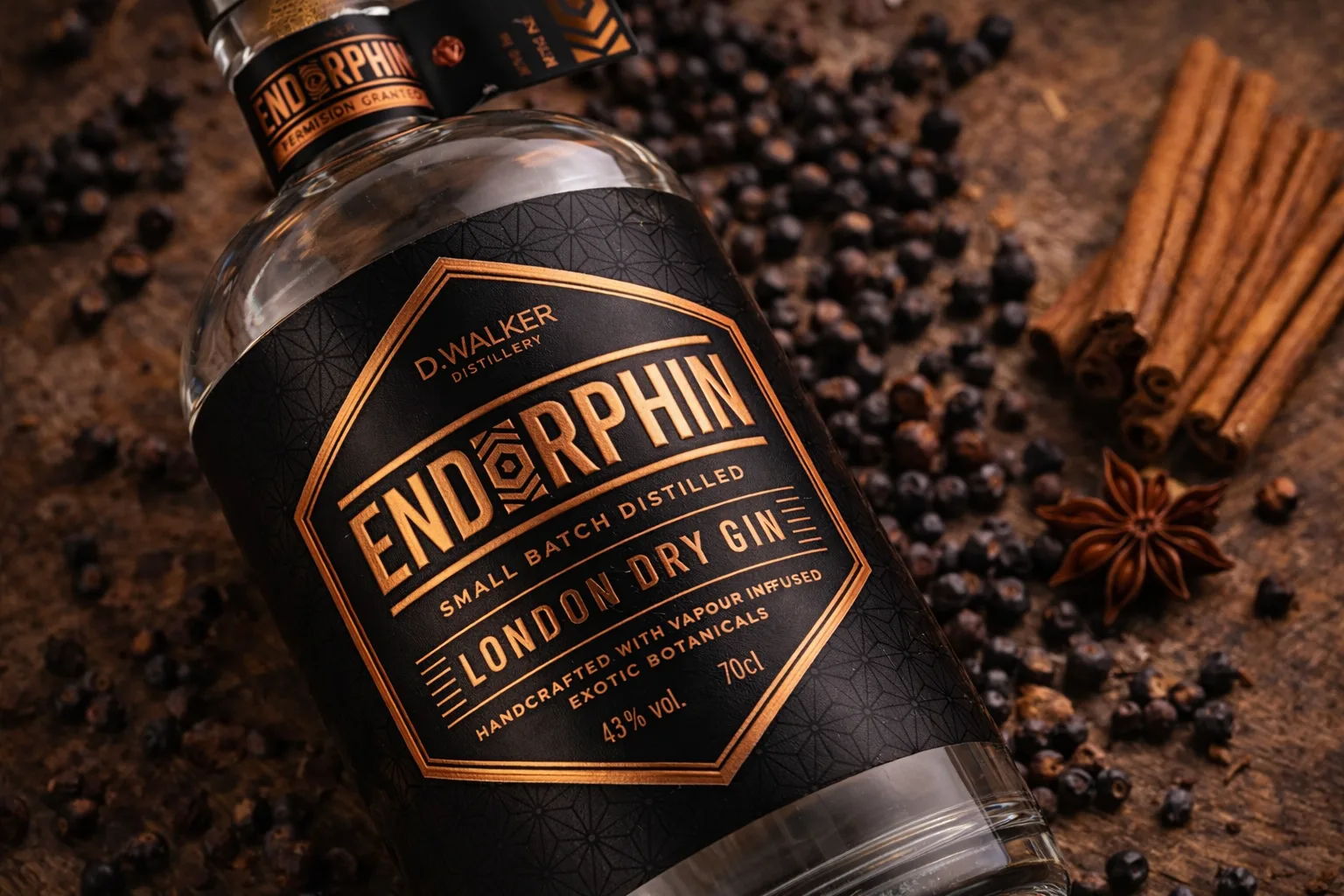
The project for Endorphin focused on creating a strong and memorable visual identity for a craft gin brand. The goal was to achieve a premium look while keeping the overall expression contemporary, clean and visually precise.
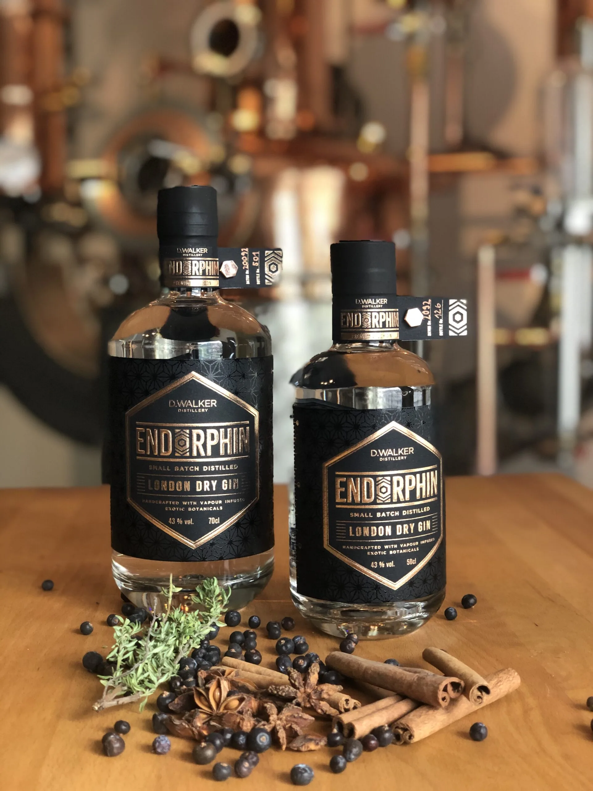
An important part of the brief was to create a visual system that could be naturally extended in the future as the product portfolio grows with new variants and flavours. For this reason, the identity is built on clearly defined elements that can be adapted without losing the character of the brand.
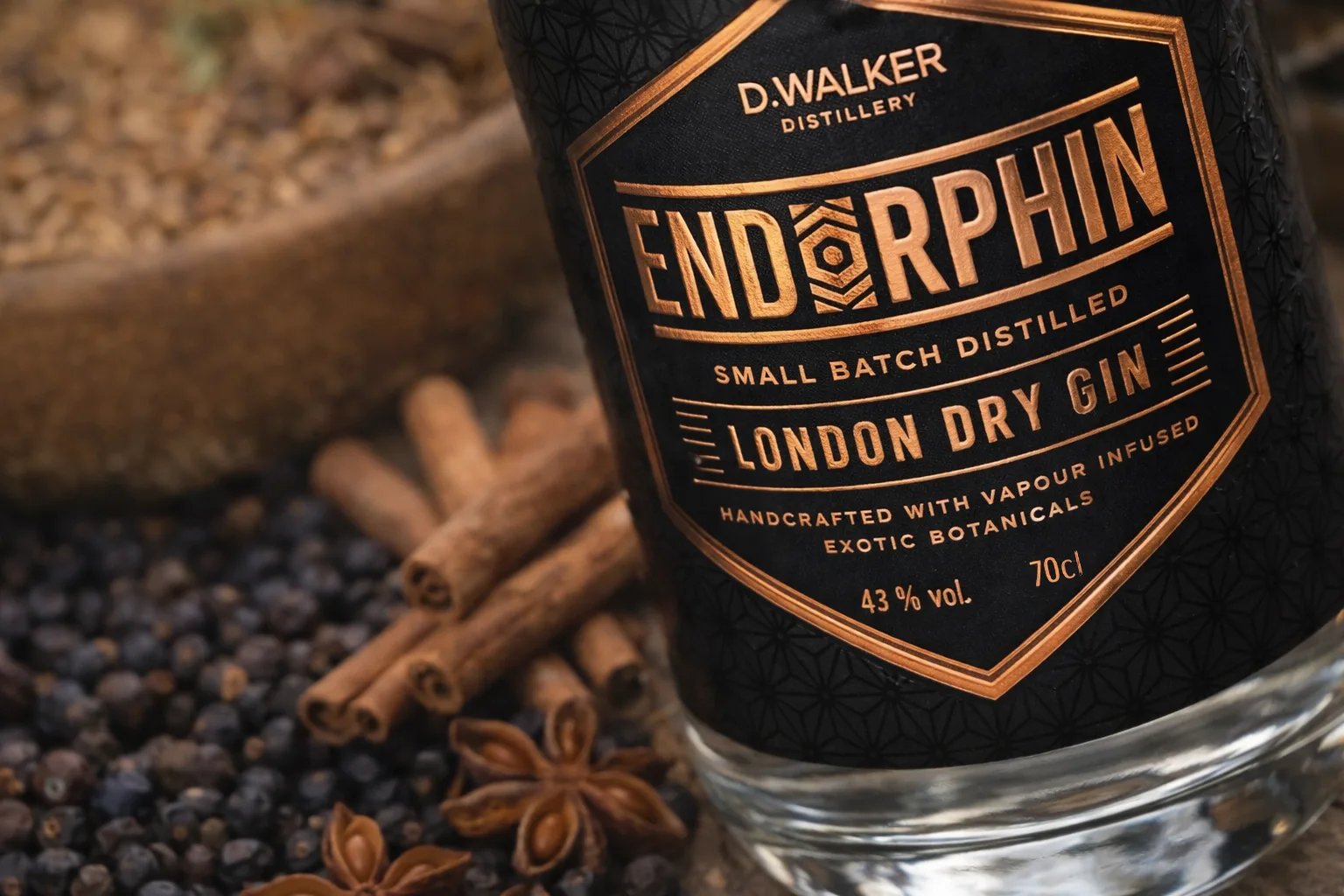
The foundation of the design is a distinctive typographic logo with a characteristic symbol. The dominant element is a stylised letter O. It is inspired by a schematic representation of the endorphin molecule, subtly connecting the brand name with its meaning in a memorable and refined way.
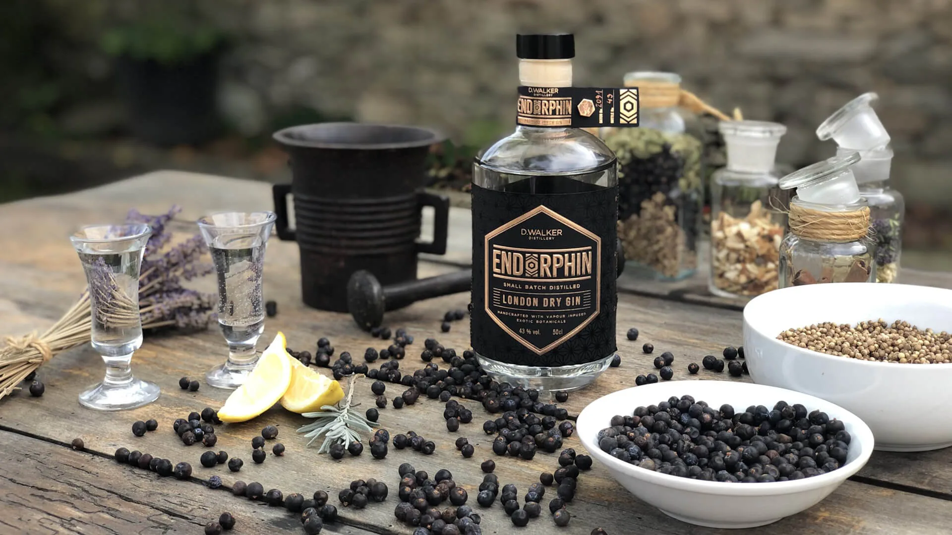
The label design is built on the contrast between a dark background and metallic accents, underlining the premium character of the product. The geometric background motif follows the logic of the logo symbol and creates a consistent visual language. The typography is clean, bold and clearly legible even from a greater distance.